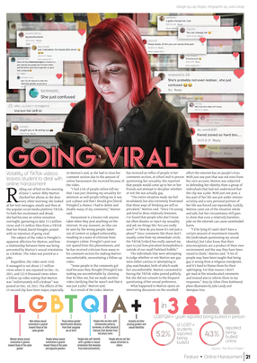
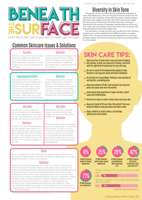
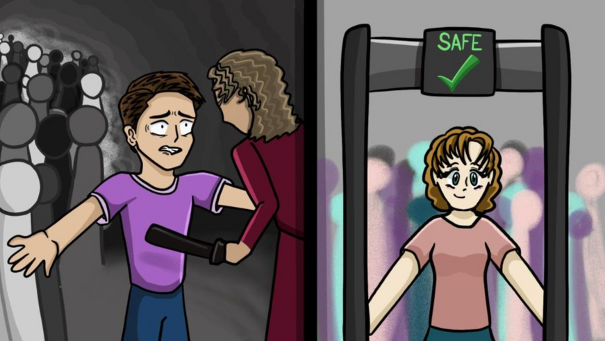
During my three years on Eagle Eye News' staff and editorial board, I have created hundreds of graphic elements for our publication across multiple platforms. The examples below include layouts from our print issue, infographics from both print and online multimedia stories, graphics which were used on our website as featured images, design elements for social media and editorial cartoons for both web and print. Additionally, I have included a few examples of my design work from my internship with the educational non-profit, New Heights Educational Group. During my time on staff, I have become industry certified in Adobe Photoshop and InDesign. I have also become proficient in Adobe Illustrator.

Design

My Work
Click image to explore section or scroll to see content
Layouts

Click content for descriptions
Layouts

All clip art used was downloaded via paid license from FreePix and Envato Elements in compliance with copyright law
Click content for descriptions
Infographics

Style Packaging
Prior to 2022, The Eagle Eye had used the same font and style packaging for all of their print issues. In 2022, my advisor and I decided to rebrand The Eagle Eye to Eagle Eye News. Along with the name change, we created an entirely new character, paragraph and object styles for our staff to use in InDesign. We also choose new fonts to be used in print.
Prior to 2022, The Eagle Eye had used the same font and style packaging for all of their print issues. In 2022, my advisor and I decided to rebrand The Eagle Eye to Eagle Eye News. Along with the name change, we created an entirely new character, paragraph and object styles for our staff to use in InDesign. We also choose new fonts to be used in print.


I created a modified version of our logo to go with the name change. The old logo used our old headline font, Lemon Milk, and the new logo uses our new headline fonts, Montserrat Bold and Lora italic, to match the style.

My advisor and I spent a week creating new paragraph, character and object styles to match the new fonts that we chose. They are available for all staff and editors in each of our Eagle Eye News InDesign files.
<


^
When we changed our style package in 2022, I created a new Table of Contents and Letter to the Editor page to fit it. This was a tricky project because I needed to make sure the content all still fit, while still sticking with the neater design. In the end, we made it work and I am very happy with it.

This is an example of two similar layouts, one (pictured left) created using the old Eagle Eye fonts, and the other (pictured right) using the new Eagle Eye fonts. The layout on the left was made my Ivy Lam, and the layout on the right was designed by Tatiana Ortiz and edited by myself.


In my junior year, I created the infographic on the left using our old-style package. At the time, I was not too happy with the way it had turned out. I was not a huge fan of the options that our old-style package gave us for infographics. Because of this, when I created the new style packages, I wanted to make sure that the first layout I created, which set the precedent, was an infographic-based layout, so I created the layout on the right. To this day, it is one of my favorite designs that I've done.

Social Media
YouTube
I outfitted our YouTube channel with a channel icon and banner, also creating playlists to list on the front page of our channel for a cleaner, more professional look.
This is a thumbnail image I designed in Photoshop for our March for Our Lives interview compilation.
I designed this lower third title bar in Wondershare Filmora to be used in my interview compilations and news packages. Having the same lower third in all of our videos adds a sense of style through the use of consistent design.

During my first year on staff, I wrote a feature story on how schoolwork impacts students' self-care habits. To promote it, I designed this Instagram story to be posted on Eagle Eye News' page, leaving room at the top and bottom for the text that Instagram adds automatically. I included the featured graphic I drew for the story online and a statistic to interest the reader. Of course, I used the fonts that we used for our print issue at the time.

As the official school newspaper, it is our job on Eagle Eye News to inform the student body of events happening at our school. I designed this graphic to be posted on our Instagram in order to announce our annual "French Week." This was one of the first graphics I made, and I feel that it shows how far I have come in design and style.

During the online school year, Eagle Eye News made use of our Twitter account in order to promote some of our new stories. I created these two graphics to be posted on Twitter, featuring quotes that were used in the story as well as artwork from the featured image graphics which I made for them.
-%20Online%20Teaching.png)
Spotify
From 2020-2022, the Eagle Eye managed the "No Pressure Podcast," which was created and produced by our staff. My first ever project for Eagle Eye News was the draw the album cover depicted on the left, which I later adapted into a Spotify icon as shown on the right.
All clip art used was downloaded via paid license from FreePix and Envato Elements in compliance with copyright law
Click content for descriptions
Internship


.png)


